
TL;DR

Get kitchen gear delivered free with Prime
- Fast, free delivery on millions of items
- Prime Video, Amazon Music and more included
- Member-only deals all year
Ina Garten recommends choosing a small color palette for kitchen items on display, citing white china and silver as one example. The Good Housekeeping report says the approach can work with existing dishes and accessories, without a full kitchen renovation or a new matching set.
Ina Garten’s decorating advice for a more cohesive kitchen is to choose a small color palette and keep to it, with white china and silver as one example. A Good Housekeeping report points to the recommendation in a post on Garten’s Substack and says it can be applied to pieces already in a kitchen, rather than requiring new cabinets or a complete set of serveware.
Garten’s advice focuses on the items visible in a kitchen, including dishes, trays and serving pieces. The Good Housekeeping report says homeowners can select a couple of complementary colors for those objects to create a more coordinated look, while keeping the items they already own. The pairing Garten names is white and silver, but the report describes the approach as adaptable to other combinations.
The recommendation does not require every piece to match. Garten advises mixing different shapes and heights, such as round bowls, flat plates and taller objects, rather than lining up identical forms. Good Housekeeping characterizes a mix of materials, shapes and undertones as potentially collected rather than chaotic when it remains within a restrained palette.
For people who display kitchenware, Garten recommends showing dishes and trays that are both useful and valued. The report also says a platter can be leaned against a wall, while cookbooks or a wireless table lamp can add height to a display. These are styling suggestions, not requirements for achieving the palette-based look.
A Cohesive Look Without Replacing Everything
The advice is relevant to readers who want to refresh a kitchen without taking on a renovation or buying a matching collection. A limited palette offers one way to make visible accessories feel connected, even if the pieces were acquired at different times. It also leaves room for personal taste: the principle is consistency in color, not a requirement to use Garten’s specific white-and-silver combination.
That distinction matters for practical reasons. Kitchenware is often replaced gradually, as pieces wear out or break, rather than all at once. A palette that accommodates new additions may make it easier to keep a display visually consistent over time. This is a design rationale in the report, not a measured claim that the method increases home value or changes how a kitchen functions.
The approach also balances order with variety. Garten’s separate advice to mix heights and shapes means a display need not look uniform to feel coordinated. For renters or homeowners who cannot change cabinetry, the suggestion offers a small-scale option focused on movable objects rather than permanent finishes.
white ceramic serving bowls and platters
As an affiliate, we earn on qualifying purchases.
As an affiliate, we earn on qualifying purchases.
Garten’s Advice on Displaying Kitchenware
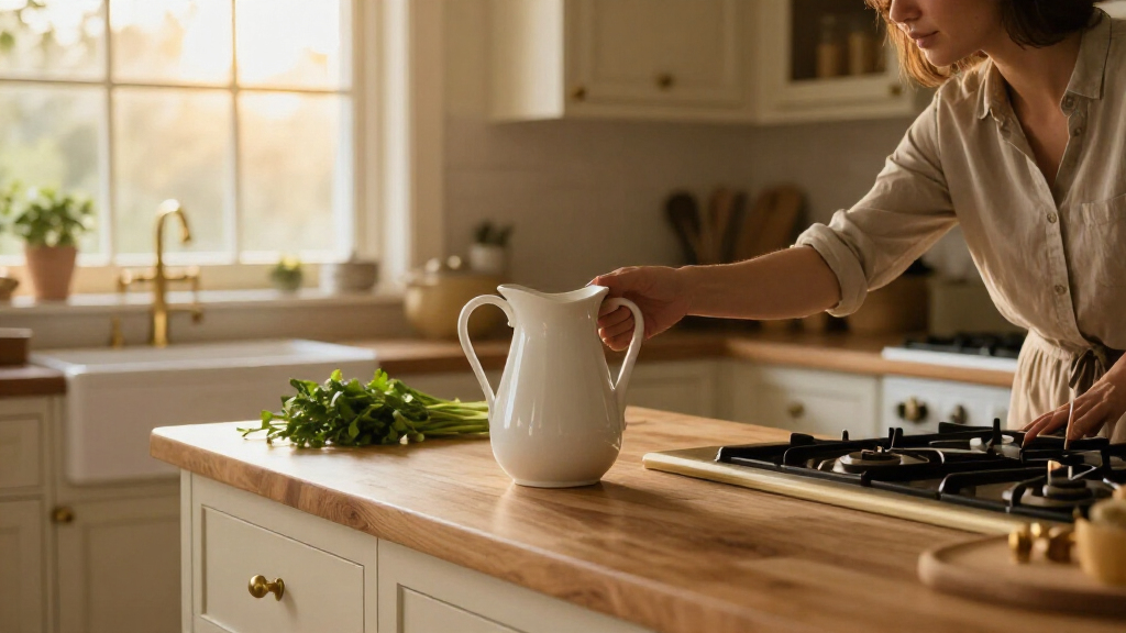
The Good Housekeeping article presents the color-palette suggestion as part of a broader set of kitchen-display tips drawn from Garten’s Substack posts. It says her social media images show muted bowls and a creamy Dutch oven alongside silver cake stands and pitchers. That observation provides an example of the combination, but it does not establish that every item in her kitchen follows the same scheme.
Garten’s other recommendations address how to arrange the objects once a palette is chosen: combine old and new pieces, vary their shapes and heights, and display items that are used and loved. The report frames these ideas as ways to make shelves or glass-front cabinets feel lived-in, rather than as a strict decorating formula.
silver serving trays for kitchen display
As an affiliate, we earn on qualifying purchases.
As an affiliate, we earn on qualifying purchases.
No Fixed Palette or Design Test
The report does not specify a formal palette size, exact shades, or rules for how much silver or white a kitchen should contain. It presents the colors as an example, not a required combination, and does not provide evidence that the technique has a measurable effect on a home’s resale value or on how spacious a kitchen appears.
It is also unclear from the source when Garten published the Substack advice or whether she intended it as a new recommendation. The report notes that similar colors appear in her kitchen imagery, but does not establish how consistently she has used them over time. The guidance is best understood as a personal decorating suggestion, not a universal standard.
As an affiliate, we earn on qualifying purchases.
Try the Palette With Existing Pieces
Readers who want to apply the idea can begin by looking at the dishes and serving pieces already visible in their kitchen, then identifying two or a few colors that recur. Garten’s example is white china and silver; another combination may better suit a particular home. The report’s approach favors working with existing pieces before buying replacements.
After choosing a palette, the suggested next step is to arrange items with varied shapes and heights, using open shelves or glass-front cabinets where available. There is no announced follow-up or product launch tied to Garten’s advice. The source presents it as an ongoing decorating principle readers can adapt to their own kitchens.
wireless table lamp for kitchen counter
As an affiliate, we earn on qualifying purchases.
As an affiliate, we earn on qualifying purchases.
Key Questions
What kitchen design trick did Ina Garten recommend?
Garten recommended choosing a small color palette and sticking to it. She gave white china and silver as an example.
Do I need to buy new dishes to use the idea?
No. The Good Housekeeping report says the approach can be applied to pieces already on display. It does not call for replacing cabinets or buying a complete matching set.
Should all the dishes and accessories match?
No. Garten recommends mixing shapes and heights, including round and flat pieces. The color palette provides cohesion while the objects can still vary.
How can I make a kitchen display feel less flat?
The report says Garten suggests leaning a platter against a wall or adding height with cookbooks or a wireless table lamp. She also recommends combining objects of different shapes and heights.
Source: rss
Halloween Picks
halloween
As an affiliate, we earn on qualifying purchases.